


SaaS Efficiency Suite for managing BPO services
Designing a multirole and multiclient tool from scratch, turning a highly configurable system into clear interfaces for each role.
Overview
 Overview
Shori is NTT DATA's Efficiency Suite, a SaaS tool to manage, automate, and streamline BPO services, integrated into the Clonika ecosystem. It is a multiclient, multirole, and highly configurable product, where each organization adapts its services, workflows, and permissions to its own needs.
I joined the project to lay the design foundations and give shape to a product built from scratch. I worked as a hybrid Product Designer and Product Strategist, defining the information architecture and the screens, along with the look and feel of the tool. I led the decision to functionally validate the user flows before moving forward, to surface the information that was not yet resolved. The core challenge was ordering a complex, highly configurable system into clear, efficient interfaces for each type of user.
Product Outcomes

Context
 Context
Shori was conceived as NTT DATA's own product, not as a commission for a single client. The goal was to offer a tool able to adapt to the specifics and scale of any organization managing BPO services, with teams spread across the country. That meant designing from scratch, with no previous tool to build on, and serving many different clients and roles at once.
Goal
 Goal
Goal
Build a flexible, configurable tool to manage, automate, and streamline BPO services, on three core premises:
-
Multiclient and multirole, with a single stable version of the product.
-
Workflow and form configuration within reach of users themselves, without depending on development.
-
Usability and consistency in a system with heavy parameterization.
Challenges
 Challenges

Understanding
the users
 Understanding
 the users
The research was carried out by the research team (6 users across 5 profiles, plus 2 individual interviews), and the functional team brought the requirements and the knowledge of users and their needs. I came in on that basis to translate that knowledge into screens, shaping a design that responded to each profile and validating that the flows served their real work.
The tool is multirole and permissions are configurable. The design centered mainly on two operational profiles with very different needs, Coordination and Operation, alongside a third, more administrative profile.
Approach
 Approach
01. Functional discovery and information architecture
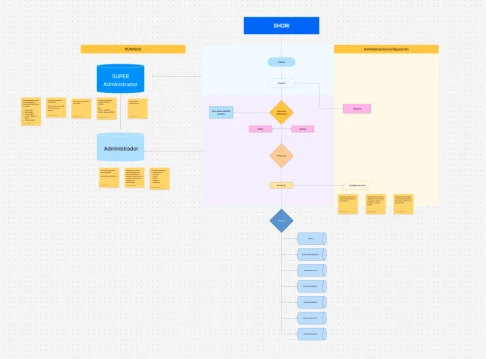
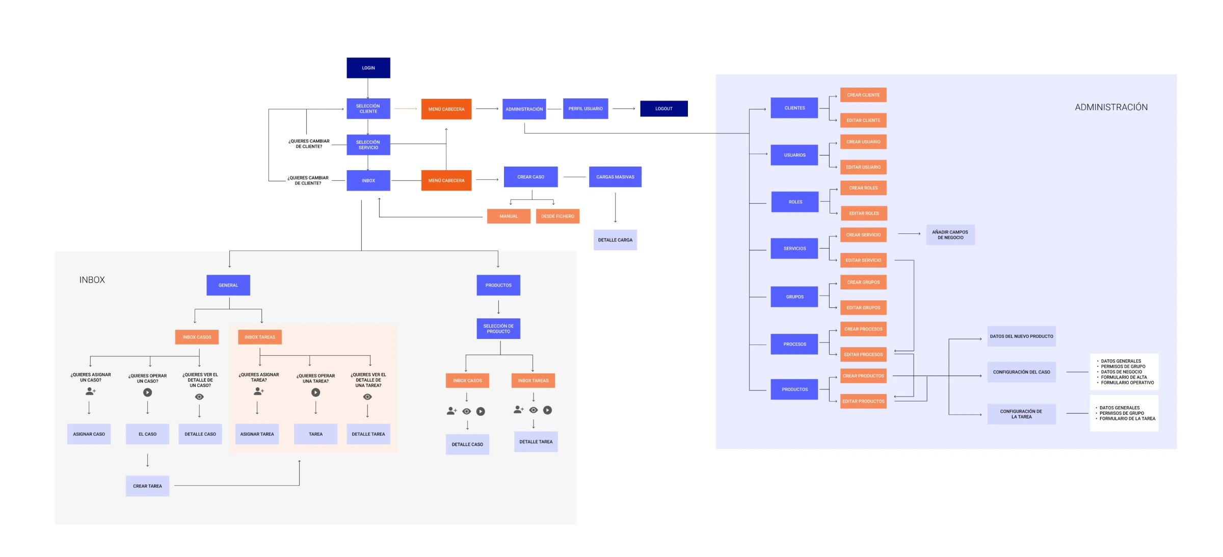
Before designing screens, I led the decision to functionally validate the user flows. Requirements came from the functional team, but as I brought them to the screen, gaps appeared: unresolved information and decisions that had not yet been made. Reviewing each flow visually was the way to surface those gaps before building, not after.
From there, I ordered the information architecture around the product hierarchy, client, tenant, service, process, and product, and translated it into navigation the user could understand without knowing that structure from the inside.
02. From requirements to screen: design and user validation
Before implementing, I translated functional requirements into visual proposals and validated them with users to make informed decisions, not just intuitive ones. The goal was to surface problems at the screen level before reaching development.
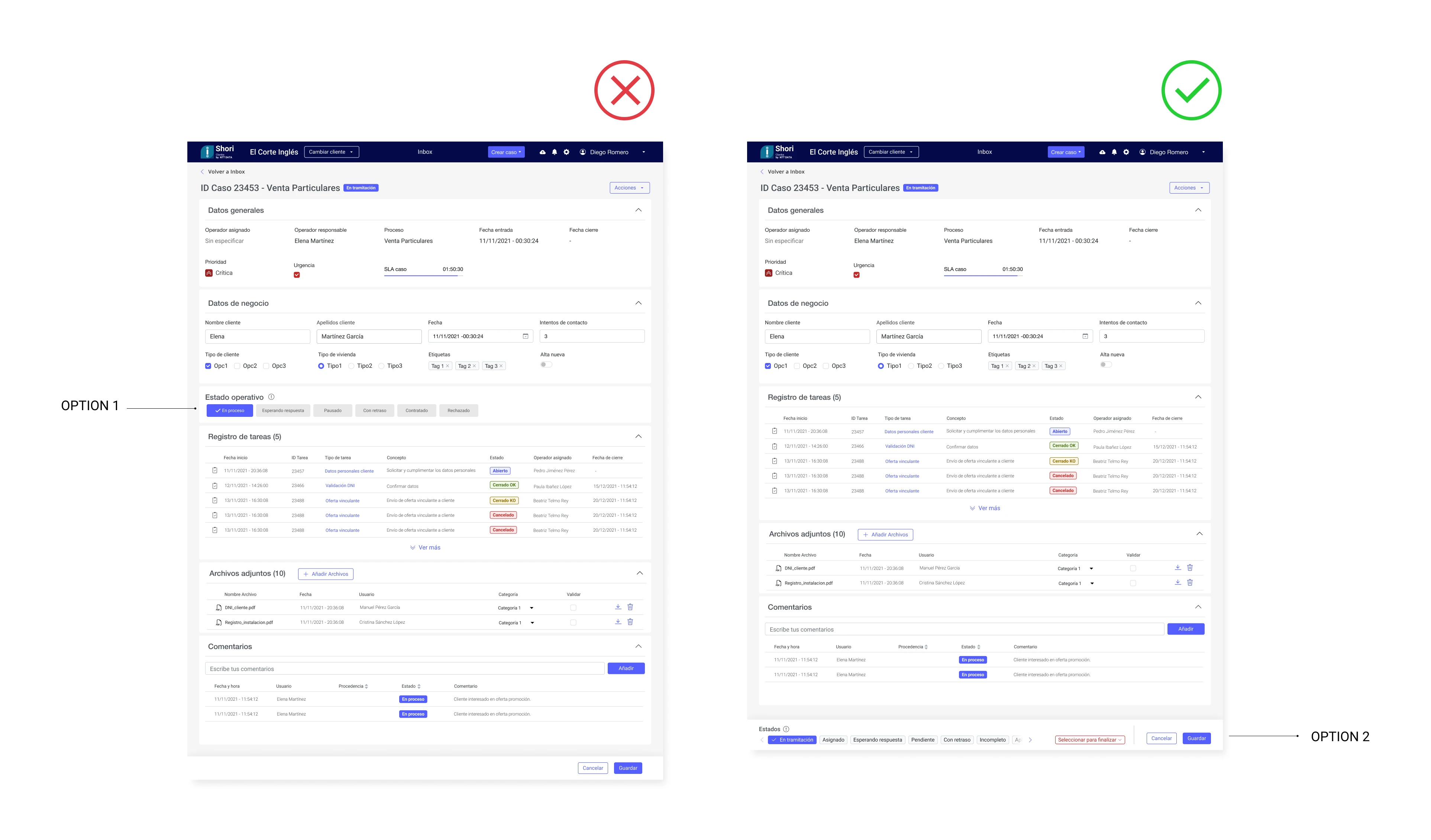
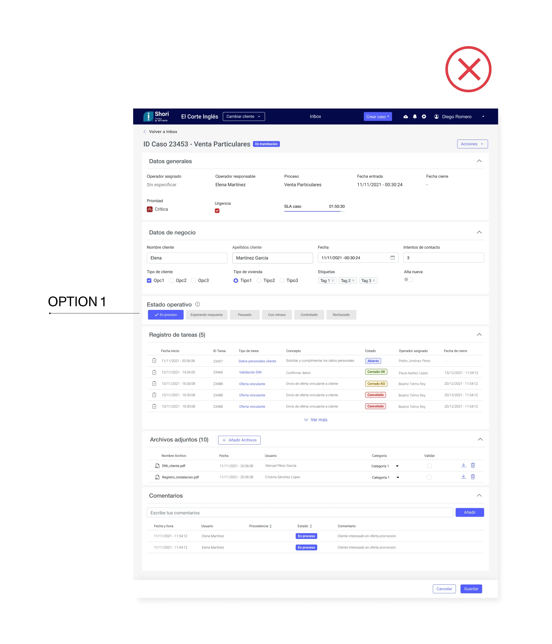
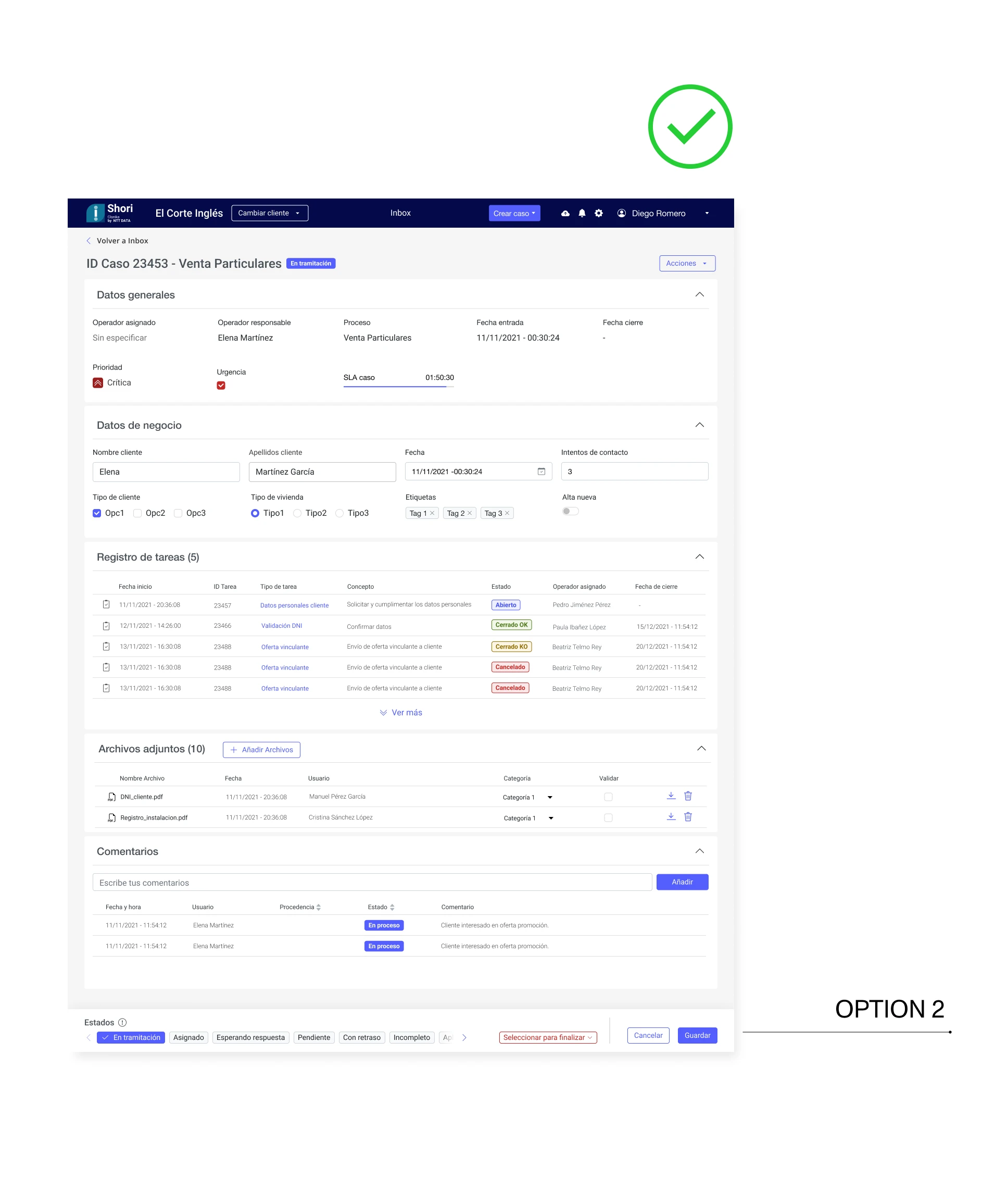
One example of that validation was the case creation screen. The user must select the case status before finalizing it, and we had to decide where to place that action. Before implementing, I compared two design proposals and validated them with several operational users:
03. Scalable, themeable design system
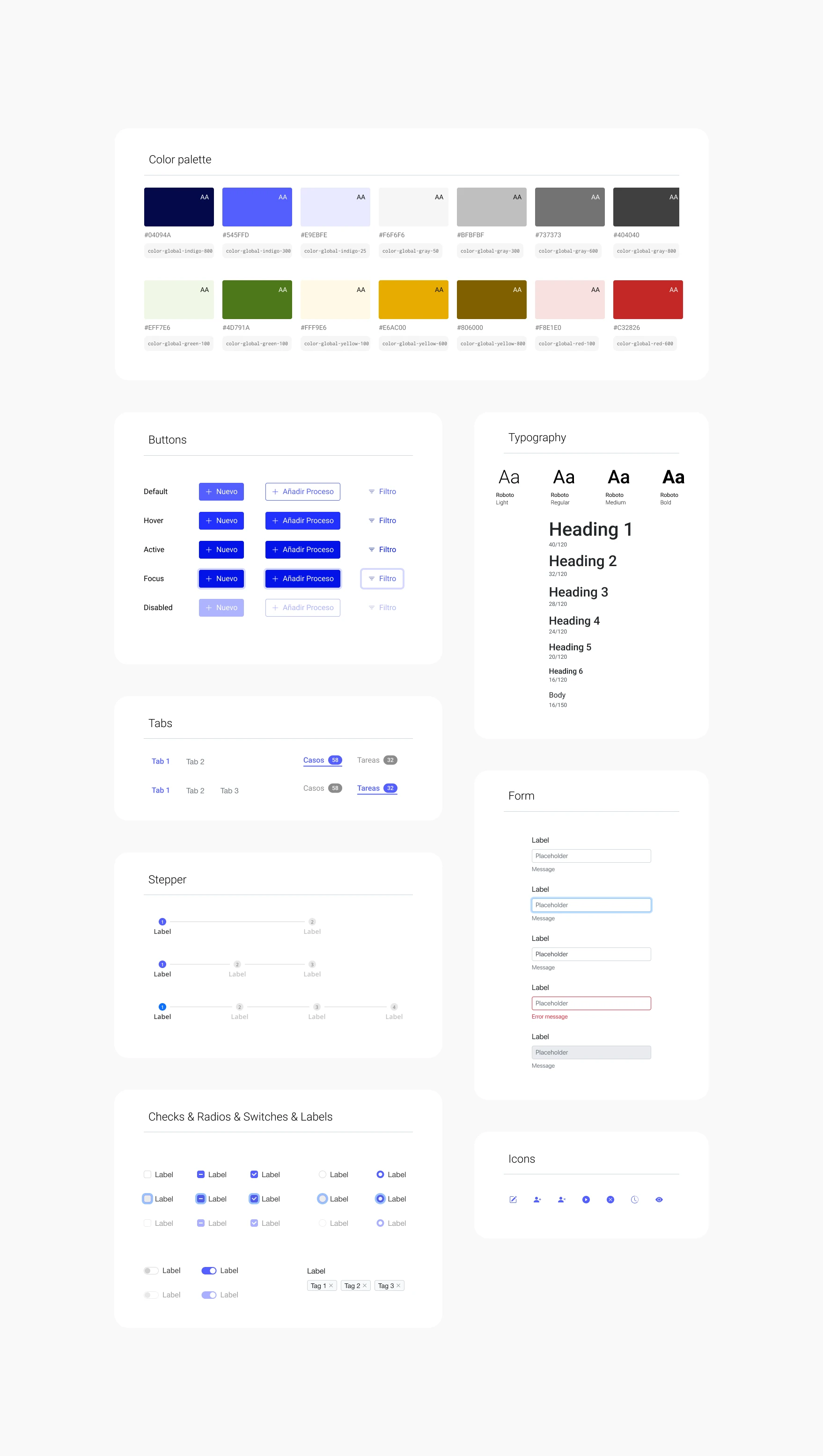
I defined the look and feel and a visual design system meant to act as a simple, neutral base, built to scale from the start. The key was that the interface could take on each client's corporate colors without redesigning anything, so the product could grow to new brands by changing only the visual layer.
The design system defined the product's visual layer, and development implemented it on the Chakra component library. Relying on a robust library instead of building components from scratch was a pragmatic decision to launch a scalable, consistent MVP without slowing the delivery pace.
Solution
 Solution
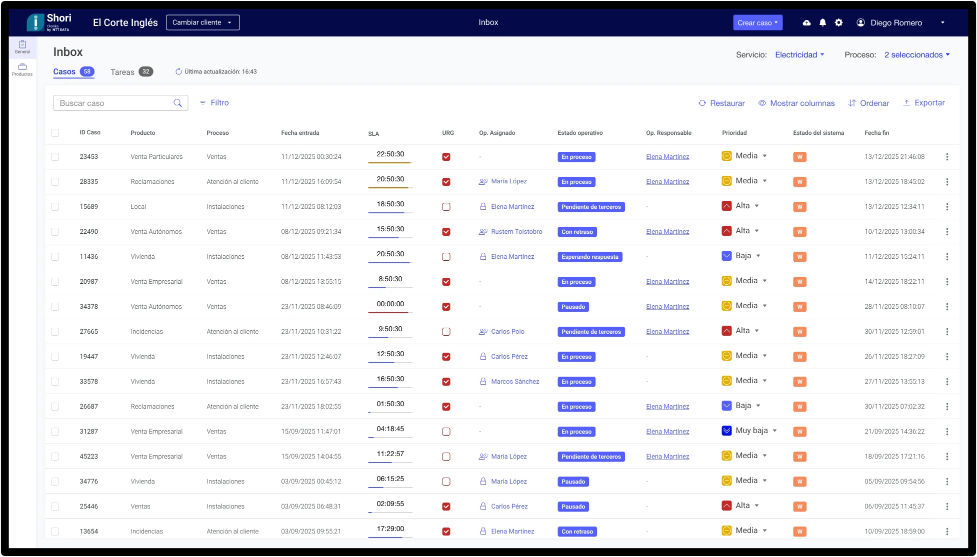
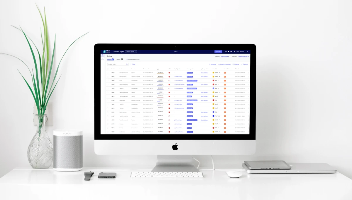
The core of the tool is the Inbox, the space where the user sees and manages their work. It is the screen that best captures the product's challenge: bringing order to a large amount of information and possible actions in a clear, operational view.
The Inbox brings together the task list with its filters, priority, SLA tracking, and actions for each task. It was designed to adapt to each user's role and to make operating fast, with the minimum number of clicks, on a neutral and scalable visual system capable of adopting each client's brand identity.
My contribution focused on the MVP and the evolution of several screens from it, laying the design foundations on which the product continued to grow.

Role Coordination and Operation
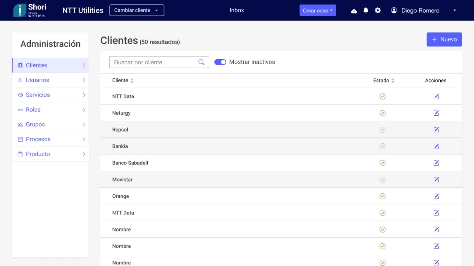
Role Administration
Learnings
 Learnings
Validating before building saves more than it costs.
Bringing requirements to the screen and reviewing them with a critical eye surfaced gaps and pending decisions that, left undetected, would have carried over into development. But before validating, you have to align: understand the team and the requirements well, understand the user, and only from there define the screens with judgment for each type of profile. Stopping to validate didn't slow the project down, it protected it.
In an operational tool, every click counts.
Thinking about design in terms of efficiency, not just clarity, changes the decisions you make. One extra step is multiplied across hundreds of tasks a day, so reducing friction is a direct impact on the user's productivity.
Design to scale from day one.
Defining a neutral visual system and relying on a robust component library wasn't a limitation, it was what let the product grow to new clients and keep evolving on solid foundations.